Notice: Recently I’ve deviated from my usual USMLE-related content and come to spend most of my graphic design time on COVID-19-related projects. As a scientist and a medical student, I want to use whatever science communication skills I have in my arsenal to help fight the battle against COVID-19 misinformation.
I was invited to join a group of rheumatologists and patient advocates who had mobilized to educate the public as well as medical professionals about hydroxychloroquine (HCQ). Often marketed as Plaquenil, HCQ is commonly prescribed for rheumatological conditions like lupus. Therefore, rheumatologists are not only very familiar with this drug and its side effects, but they also bear witness to the impact of HCQ shortages on patients who depend on it. This group organized themselves, largely via social media, under the name #HCQBrigade and authored a variety of peer-reviewed articles on the topic.
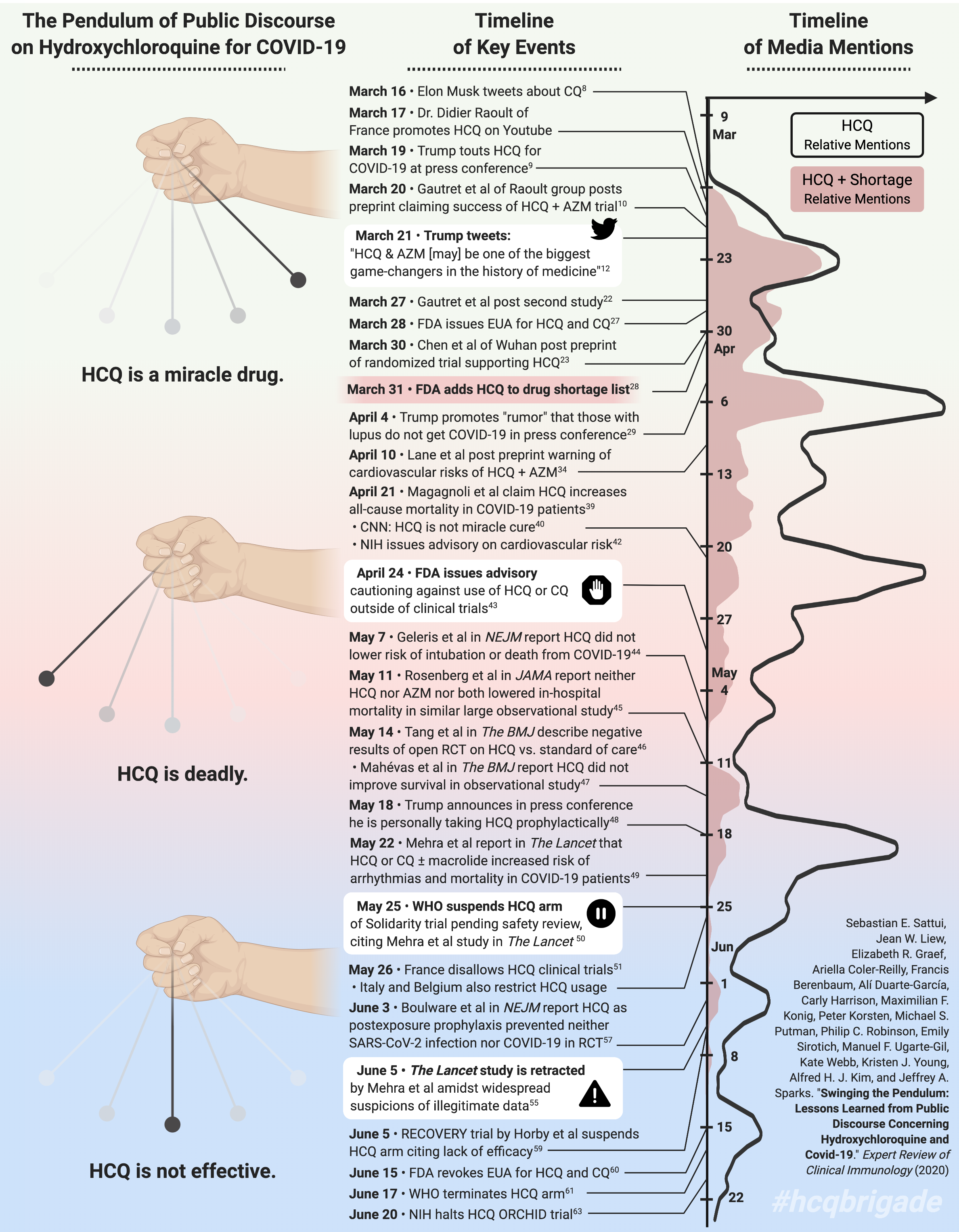
I contributed a graphic to one such article: an invited review describing key events in Spring and Summer that sparked the dangerously chaotic media frenzy over HCQ. As of my writing this post, it is already October, and yet sadly the HCQ debate still rages on, and our article remains timely as ever. Please find the images and the details of their publication below.
Share freely. – Since the attributions are included within the images posted here, you may freely distribute these images as you please.
I created the graphic using a mixture of BioRender and Adobe Illustrator. It was published in the Expert Review of Clinical Immunology as part of the #HCQBrigade review article, “Swinging the pendulum: lessons learned from public discourse concerning hydroxychloroquine and COVID-19.” The article is open access, so anyone may click the link and download it for free.
The timeline flows from top (early March) to bottom (late June). On the left, a swinging pendulum represents the overall trend of public discourse surrounding HCQ for COVID-19. Key events are listed in the middle column (see full text for references). On the right is a quantitative view of how much HCQ was mentioned in the media, showing how spikes correspond to certain key events.
Once the article was published, I posted the image and a link to the publication on Twitter. Thanks to retweets from my co-authors (and, ironically, the HCQ media frenzy), the tweet quickly became widely shared. Though pleased at the tweet’s success, I experienced mixed emotions when a rush of passionate — and often highly critical — comments poured in. I tried to respond to sincere concerns from patients, issue well-crafted rebuttals to misinformed commenters, and ignore trolls purposefully spreading disinformation. It was challenging, but rewarding — I felt like perhaps I was truly making a difference, at least in my small sphere of influence. If you’d like to explore the comment frenzy, check out the twitter thread (and RT if you’re feeling generous).
We also translated the graphic to French…

… and to Spanish!


Finally, the COVID-19 Global Rheumatology Alliance in conjunction with the #HCQBrigade published a layperson summary of our Expert Review article intended to educate the general public. For this spinoff publication, I created a modified graphic. I grouped key events into more digestible categories, applied more color-coding, and included a key comparing the level of evidence in different types of studies.

1 Comment